![]()
Clustering and Classification Methods - Basics, Strengths and Weaknesses
Clustering and classification are some of the most fundamental tasks in machine learning and are closely tied to each other. Clustering is performed on unlabeled data and tries to find similarities between data points to cluster them together into groups (for example based on some distance metric). Classification addresses a similar challenge, although this time we’re dealing with labeled data. We talk of classification when, based on the labeled dataset, we try to classify a new, unlabeled observation.
Underneath is an introduction to a few most popular and fundamental techniques used in ML when dealing with those two tasks. They are hardly the most sophisticated methods, but are good to know - they are often surprisingly effective and even if not, are a good spring board towards more advanced approaches.
K-Means
K-Means is probably the simplest clustering algorithm. It’s an unsupervised learning algorithm, so it tries to find patterns in unlabeled data. To be precise, it tries to divide the data points in our dataset into clearly separate groups (or “clusters”). Each data point is represented by a vector of length of at least 1.
An important parameter of the clusters we create is the centroid - the center point of the cluster. The algorithm will try to minimize the sum of squared distances between data points and their assigned centroids:
\[\text{Euclidean Distance} = \sqrt{\sum_{i=1}^{n} (x_i - y_i)^2}\]Steps
K-Means follows the following logic:
- We initialize the algorithm by picking centroids at random coordinates. We also have to decide how many of those centroids will be created.
- We assign our data points to the centroids they are closest to (judging by Euclidean distance).
- With data points assigned, let’s try to improve on the centroid location. We calculate the mean point in each cluster, based on the member data points. This point should be relatively close, on average, to the points in the cluster, so we make it our new centroid.
- With new centroids set, let’s reassign the data points. The centroids have moved after all, so some data points may now be closer to other clusters.
- We repeat those steps until our groups converge.
Convergence
How do we determine that the algorithm has converged? A widely used metric is inertia or within-cluster sum of squares (WCSS), which is just a sum of squared Euclidan distances of all the data points in the dataset:
\(\text{WCSS} = \sum_{i=1}^{k} \sum_{j=1}^{n_i} ||x_j - c_i||^2\) Where:
- k is the number of clusters.
- ni is the number of data points in cluster i.
- xj is a data point.
- ci is the centroid of cluster i.
- ||xj - ci||2represents the squared Euclidean distance between a data point and its assigned centroid.
If ingertia changes minimally between the iterations, we can say that the algorithm has converged. Alternative ways of assessing convergance is to track the movement of centroids - if they’ve stopped moving on a large scale, we can also say we’ve reached a convergence. Third method is to track the stability of the silhouette score, which is a metric that measures the cohesion in the cluster (how concentrated points are around the centroid) and separation between clusters.
Strengths
- Efficient - Not demanding in computing power, which comes in handy with large datasets.
- Scalable - Works well with high-dimensional data (long vectors).
Weaknesses
- Spherical clusters - Since at each iteration we’re moving the centroids to the mean point in the cluster, their shapes will resemble spheres. Real world data may require more abstract cluster shapes than that.
- Sensitive to initial points - Results may vary depending on where you initialize the centroids.
- Sensitive to number of clusters - You need to specify the number of centroids you want and finding the proper number can be a challenge.
- Sensitive to outliers - Outliers in the data can be falsely attributed to a given cluster, disrupting the centroid. If they’re present in the dataset, preprocessing is necessary.
import numpy as np
import matplotlib.pyplot as plt
from sklearn.datasets import make_blobs
from sklearn.cluster import KMeans

# Set seed for reproducibility
np.random.seed(42)

# Generate data with round clusters
data_a, labels_a = make_blobs(n_samples=300, centers=3, cluster_std=1.0, random_state=42)

# Apply K-Means clustering to round cluster data
kmeans_a = KMeans(n_clusters=3, random_state=42)
kmeans_a.fit(data_a)

# Generate data with irregular clusters
data_irregular = np.concatenate([
    np.random.randn(150, 2) * 1.5,
    np.random.randn(100, 2) * 0.5 + np.array([6, 6]),
    np.random.randn(80, 2) * 1.2 + np.array([-3, 4]),
    np.random.randn(120, 2) * 0.8 + np.array([-1, -2]),
    np.random.rand(60, 2) * 8 - np.array([4, 6]),
    np.random.rand(50, 2) * 4 - np.array([1, 2]),
])

# Apply K-Means clustering to irregular cluster data
k_means_irregular = KMeans(n_clusters=6, random_state=42)
k_means_irregular.fit(data_irregular)

# Visualize the clustering
plt.figure(figsize=(16, 6))

# Example 1: Successful K-Means Clustering with round clusters
plt.subplot(1, 2, 1)
plt.scatter(data_a[:, 0], data_a[:, 1], c=kmeans_a.labels_, cmap='viridis', edgecolors='k')
plt.scatter(kmeans_a.cluster_centers_[:, 0], kmeans_a.cluster_centers_[:, 1], c='red', marker='X', s=200)
plt.title('Example 1: Successful K-Means Clustering')
plt.xlabel('Feature 1')
plt.ylabel('Feature 2')

# Example 2: Unsuccessful K-Means Clustering with irregular clusters
plt.subplot(1, 2, 2)
plt.scatter(data_irregular[:, 0], data_irregular[:, 1], c=k_means_irregular.labels_, cmap='viridis', edgecolors='k')
plt.scatter(k_means_irregular.cluster_centers_[:, 0], k_means_irregular.cluster_centers_[:, 1], c='red', marker='X', s=200)
plt.title('Example 2: Unsuccessful K-Means Clustering with Irregular Clusters')
plt.xlabel('Feature 1')
plt.ylabel('Feature 2')

plt.tight_layout()
plt.show()
/usr/local/lib/python3.10/dist-packages/sklearn/cluster/_kmeans.py:870: FutureWarning: The default value of `n_init` will change from 10 to 'auto' in 1.4. Set the value of `n_init` explicitly to suppress the warning
  warnings.warn(
/usr/local/lib/python3.10/dist-packages/sklearn/cluster/_kmeans.py:870: FutureWarning: The default value of `n_init` will change from 10 to 'auto' in 1.4. Set the value of `n_init` explicitly to suppress the warning
  warnings.warn(
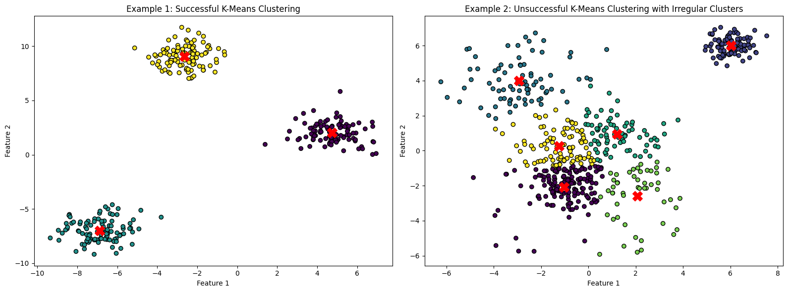
Example 1 shows clearly defined, roughly spherical clusters. In Example 2 the clusters are irregular and spread out (except the one in the top right, which looks correct). The centroid of the light green cluster is visibly misplaced from the center of the blob, suggesting the impact of outliers. Silhouette score and Davis-Bouldin index are two ways of assessing the quality of the clusters in a numeric way.
Real Life Example
Imagine you have a dataset of customer information, including purchase history. K-Means clustering can help group customers based on similarities in their purchasing behavior. This can assist businesses in targeted marketing to different customer segments. Before using K-Means you should make sure that the customer data forms clearly defined, roughly spherical blobs.
Hierarchical Clustering
Another unsupervised ML clustering method is hierarchical clustering. It allows us to build a tree, representing not only clusters, but also the order of similarity between them.
Steps
Hierarchical clustering follows the following logic:
- We calculate a matrix of Euclidean distances between all data points.
- At first, we treat all of our data points as separate clusters.
- We calculate the distance between clusters. At first this is the our matrix from earlier, but later on, when our clusters become bigger, it will differ. We define a separate metric for cluster distance, which will influence the shape of our clusters. The popular choices are:
- Single Linkage: Distance between two clusters is defined by the minimum distance between any two points in the clusters. Tends to form elongated clusters.
- Complete Linkage: Distance is defined by the maximum distance between any two points in the clusters. Tends to form compact, spherical clusters.
- Average Linkage: Distance is defined by the average distance between all pairs of points in the clusters and falls in between with the shape.
- Based on pairwise cluster distances, we merge the two closest ones.
- Repeat until we get a single cluster.
Strengths
- Cluster hierarchy - The lengths of the tree branches represent how big is the distance between the clusters, providing additional information in interpreting the output.
- Complex shapes of clusters - Various linkage types allow for creation of non-spherical clusters, unlike the K-Means method.
- No assumption on cluster number - Unlike K-Means, we don’t have to manually pick the number of clusters we want.
Weaknesses
- Computationally expensive - High computational complexity and memory demand. Tough on large datasets - can reach O(n3) complexity, so prepare yourself a big coffee and triple check your memory availability.
- Sensitive to outliers - Outliers can heavily impact formation of the clusters.
import numpy as np
import matplotlib.pyplot as plt
from scipy.cluster.hierarchy import dendrogram, linkage, fcluster
# Generate synthetic data, let's say 20 examples of data points, consisting of 2-variable long vectors
np.random.seed(42)
data = np.random.rand(20, 2)
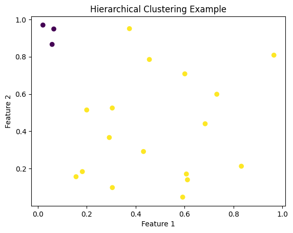
# Perform hierarchical clustering with average linkage
tree = linkage(data, method='average')
# Cut the dendrogram to obtain clusters at a specific level - since we're not interested in final, single cluster, let's pick the two biggest ones
threshold = 0.7
clusters = fcluster(tree, t=threshold, criterion='distance')
# Visualize the data points with colors representing the chosen clusters
plt.scatter(data[:, 0], data[:, 1], c=clusters, cmap='viridis')
plt.title('Hierarchical Clustering Example')
plt.xlabel('Feature 1')
plt.ylabel('Feature 2')
plt.show()
Real Life Example
Imagine that you’re working with biological data (DNA sequences) representing different species. Based on those sequences you want to find out the order of their evolution. You could use hierarchical clustering (or one of its many variants) to find out the distances between clusters of sequences and create an evolutionary tree.
K-Nearest Neighbors
Time for a supervised ML algorithm - K-Nearest Neighbors. Supervised means that we are provided not only with a dataset of observations, but also the associated labels. Similarly to K-Means, this is a really simple approach, revolving around the idea that when we try have a new observations, we should look at similar observations from out dataset and assign a label based on them.
Steps
Nearest Neighbors algorithm follows the following logic:
- Pick parameter k - number of nearest neighbors considered when labeling a new observation
- Add a new observation (a data point without a label) and calculate Euclidean distances between this point and the labeled data points in the dataset.
- Pick k points from the dataset that are the closest to the new observation.
- The label that occurs most frequently among nearest neighbors becomes the new observation’s label.
Strengths
- Complex shapes of clusters - Can adapt well to non-linear decision boundaries.
Weaknesses
- Computationally expensive - For every prediction, you need to calculate Euclidean distance in regards to every data point in the dataset. On large datasets this can be rather slow.
- Sensitive to outliers - A classic weakness of most vanilla clustering algorithms. Outliers can sometimes become a nearest neighbor of a new observation, skewing the labeling process.
import numpy as np
import matplotlib.pyplot as plt
from sklearn.neighbors import KNeighborsClassifier
from sklearn.datasets import make_classification

# Generate synthetic data with two classes and a point we want to classify
X, y = make_classification(n_samples=100, n_features=2, n_informative=2, n_redundant=0, n_clusters_per_class=1, random_state=42)
new_data_point = np.array([[0, 0]])

# Fit k-Nearest Neighbors classifier, let's pick k = 5
k = 5
knn_classifier = KNeighborsClassifier(n_neighbors=k)
knn_classifier.fit(X, y)

# Predict the class of the new data point
predicted_class = knn_classifier.predict(new_data_point)

# Plot the original dataset and new data point
plt.figure(figsize=(8, 6))
scatter = plt.scatter(X[:, 0], X[:, 1], c=y, cmap='viridis', edgecolors='k', label='Original Data')
plt.scatter(new_data_point[:, 0], new_data_point[:, 1], c='red', marker='X', s=100, label='New Data Point')

# Highlight the neighbors used for classification
distances, indices = knn_classifier.kneighbors(new_data_point)
neighbor_scatter = plt.scatter(X[indices, 0], X[indices, 1], facecolors='none', edgecolors='blue', linewidths=1, s=150, label='Neighbors')

plt.title('k-Nearest Neighbors Classification')
plt.xlabel('Feature 1')
plt.ylabel('Feature 2')

# Adjust the legend to showcase original data, classified observation and the nearest neighbors picked for labeling
legend_labels = {0: 'Class 0', 1: 'Class 1', 'new_data': 'New Data Point', 'neighbors': 'Nearest Neighbors Used for Classification'}
handles = [plt.Line2D([0], [0], marker='o', color='w', markerfacecolor=scatter.cmap(scatter.norm(c)), markersize=10, label=legend_labels[c]) for c in np.unique(y)]
handles.extend([plt.Line2D([0], [0], marker='X', color='red', linestyle='None', markersize=10, label=legend_labels['new_data']),
                plt.Line2D([0], [0], marker='o', color='blue', linestyle='None', markersize=10, markerfacecolor='none', label=legend_labels['neighbors'])])
plt.legend(handles=handles, title='Legend')

plt.show()

print(f"The predicted class for the new data point is: {predicted_class[0]}")
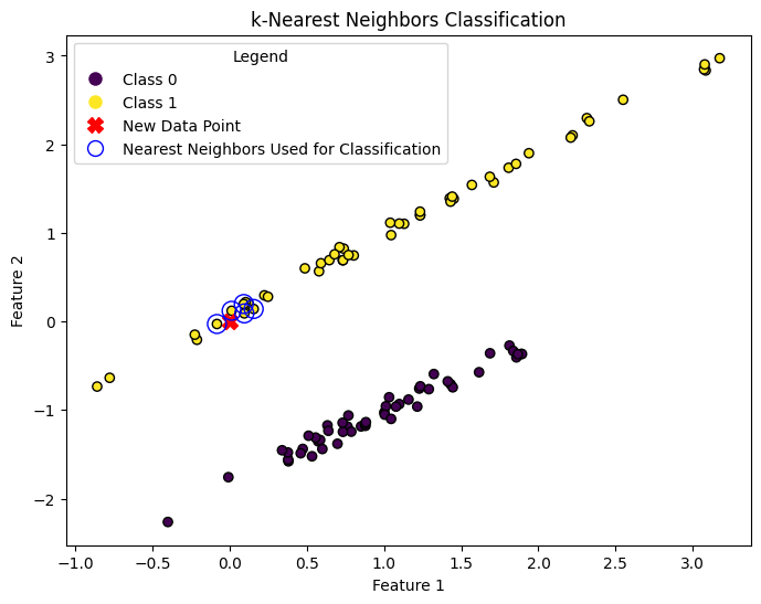
The predicted class for the new data point is: 1
Real Life Example
You have a dataset of handwritten digits, and you want to identify the digit for a new handwritten image. These days such tasks are handled but neural nets, but KNN is a lightweight alternative. KNN can be used for this task by finding the k-nearest neighbors from the dataset to the new image and assigning the digit that appears most frequently among those neighbors.
Logistic Regression
Logistic regression is another way to classify new observations. It’s a supervised learning method and can have multiple forms, by default it allows us to make a binary choice between two opposing classes (i.e is_dog, is_not_a_dog). There are ways to use logistic regression for multi class choice, but for this introduction we will focus on the classic, binary classification.
Logistic regression naturally extends the concept of linear regression, which makes use of the linear relationship between independent variables and the dependent variable to create a predictor model.
The linear regression equation:
\[y = mx + b\]Where:
y - is the dependent variable (the one we’re trying to predict).
x - is the independent variable (the one we use to make predictions).
m - is the slope of the line, representing how much y changes for each one-unit change in x.
b - is the y-intercept, the point where the line crosses the y-axis when x is 0.
In linear regression we get an output in the form of a continuous value, ranging from negative to positive infinity. But what we would want to get in logistic regression is a probability, and to be precise - a probability that our dependent variable belongs to our class (is_dog). Probability ranges from 0 to 1, so we need some way to transform the output from linear regression into a scale from 0 to 1. Fortunately, math knows a function called sigmoid function (or logistic function), which will do exactly that - take an input and pack it into 0-1 range.
\[P(Y=1|z) = \frac{1}{1 + e^{-z}}\]Where:
P(Y=1|z) - is the probability of the event Y happening given the input z.
e - the mathematical constant approximately equal to 2.71828.
z - is the input variable
If we substitute input z as linear regression equation, we get the logistic regression:
\[P(Y=1|x) = \frac{1}{1 + e^{-(b_0 + b_1 \times x)}}\]Where:
P(Y=1|x) - is the probability of the event Y happening given the input x.
e - the mathematical constant approximately equal to 2.71828.
b0 - is the intercept term.
b1 - is the coefficient for the input feature x.
Steps
With the theory behind logistic regression known all that’s left is to actually train the model on our labeled dataset. Unlike the methods mentioned earlier, the steps towards finding the proper parameters are not as straightforward. Logistic regression usually uses gradient descent algorithm to find the optimal weights for the model, the same one that’s used in the widely popular neural nets.
While the math behind it is a little bit ambitious for this introductory tutorial, the algorithm can be compared to a ball running down a hill in very small steps. At each step our math calculates what direction should the ball roll down next to find the lowest point.
Strengths
-
Interpretability - As mentioned earlier, it provides easily interpretable results. The coefficients can be interpreted in terms of the impact of each feature on the predicted probability.
-
Efficient - Finding the optimal parameters can work quite fast even on large datasets, as gradient descent is very effective in what it does.
Weaknesses
-
Assumes linearity - The model assumes that your dependent and independent variables are related in a linear way. If they are not, which is quite often the case, you might need to use another model.
-
Binary classification - While multi class logistic regression exists, it is usually not the first choice for those problems. Logistic regression deals well with binary classification, which limits its potential usage.
-
Finding the threshold - While logistic regression gives you a probability of belonging to a modelled class, you still have to intepret it. If your model thinks a patient belongs to the has_cancer class with 51% confidence, are you convinced with that and will inform the patient?
In many cases you need higher confidence. To address this, sometimes it is necessary to decide on a threshold below which the prediction of the model will not be considered as positive.
import numpy as np
import matplotlib.pyplot as plt
from sklearn.linear_model import LogisticRegression
from sklearn.datasets import make_classification
from sklearn.model_selection import train_test_split
from sklearn.metrics import accuracy_score

# Generate synthetic data
X, y = make_classification(n_samples=100, n_features=1, n_informative=1, n_redundant=0, n_clusters_per_class=1, random_state=42)

# Split the data into training and testing sets
X_train, X_test, y_train, y_test = train_test_split(X, y, test_size=0.2, random_state=42)

# Train logistic regression model
model = LogisticRegression()
model.fit(X_train, y_train)

# Make predictions on the test set
y_pred = model.predict(X_test)

# Plot the results of our regression, along with training and testing data
x_values = np.linspace(min(X.min(), -1), max(X.max(), 1), 100).reshape(-1, 1)
y_values = model.predict_proba(x_values)[:, 1]

plt.scatter(X_train, y_train, c='blue', label='Training Data')
plt.scatter(X_test, y_test, c='green', marker='x', label='Testing Data')
plt.plot(x_values, y_values, c='red', label='Decision Boundary')
plt.xlabel('Feature')
plt.ylabel('Probability of Class 1')
plt.title('Logistic Regression')
plt.legend()
plt.show()

# Print accuracy on the test set
accuracy = accuracy_score(y_test, y_pred)
print(f'Accuracy on the test set: {accuracy:.2f}')
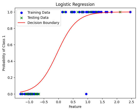
Accuracy on the test set: 1.00
Real Life Example
You’re a banker and want to predict if your new clients will default (not pay) or not, based on a dataset with information on your past clients. You know their business type, region etc. and whether they defaulted or not. You use this data to perform logistic regression and predit the probability of your new clients defaulting.